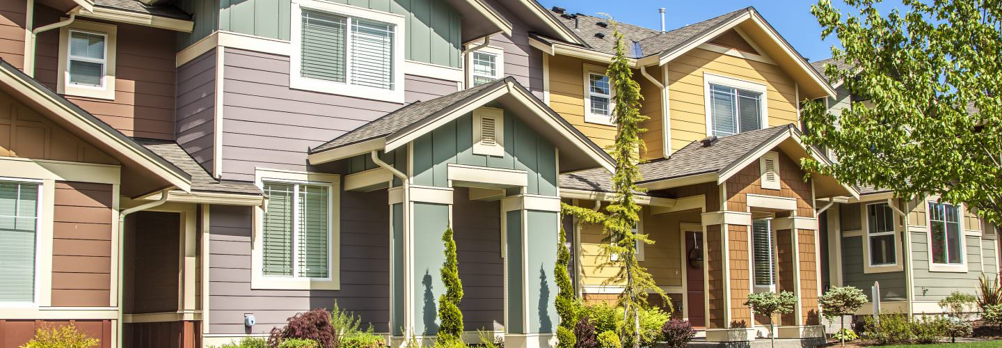
House Painting Colour Trends
Basic House Paint Colour Trends
Everyone chooses colours in their own way. Here we’ve assembled all the information you need to navigate your own path. Whether you already have firm colour ideas, need inspiration from examples and house painting colour trend palettes, want to work with a professional colour consultant, or simply desire house painting colour tips, CertaPro Painters® colour resources make the colour selection process simple and stress free.
Learn the Colour Basics for House Painting Trends and Ideas
A. Find the existing dominant colour that you like, or wish to keep, in the room or on the house. On an exterior, this could be the colour of the brick or stone, pre-finished windows, or roof. For an interior, it could be the colour of your sofa, your flooring, or your window coverings.
B. Determine what kind of feeling you wish to have in the room or on the home. Warm colours, such as red, orange, yellow or beige, can create an invigorating mood or add cozy intimacy to large spaces. They can help warm up a room that has northern or eastern exposure. Blues, greens, violets or grays, the cool colours, give a serene feeling and can add spaciousness to small places. The balance between light colours and deep colours should also be considered when choosing your house paint colours.
C. Consider how complex a colour scheme you wish to undertake. There are three main colour schemes to choose from.
The Colour Basics of House Painting Ideas and Colour Schemes
- Monochromatic schemes are based on one hue, which varies in value (lightness and darkness), and saturation (the amount of colour). An example of this is a pale blue with a pure blue and dark blue.
- Analogous schemes combine no more than three similar colours. An example of this is red, yellow red (orange), and yellow.
- Complementary schemes are based on opposing colours. This scheme offers more contrast and can introduce both warm and cool colours into the area. An example would be the burgundy complementing the three shades of green in our front door. Notice application of monochrome, analogous and complementary schemes with the cream window and burgundy panels.
Colour Tip
When trying to pair up different colours in the same area, remember that any two colours side-by-side on the colour wheel will work together. Any three colours side-by-side can be used to create a colour scheme call “analogous”.
Do you love the colour but not the shade?
If you see a colour you like but you do not like the shade of the colour, find it on a colour strip, and choose a lighter or darker colour on that strip.


